Filipino American International Book Festival Branding
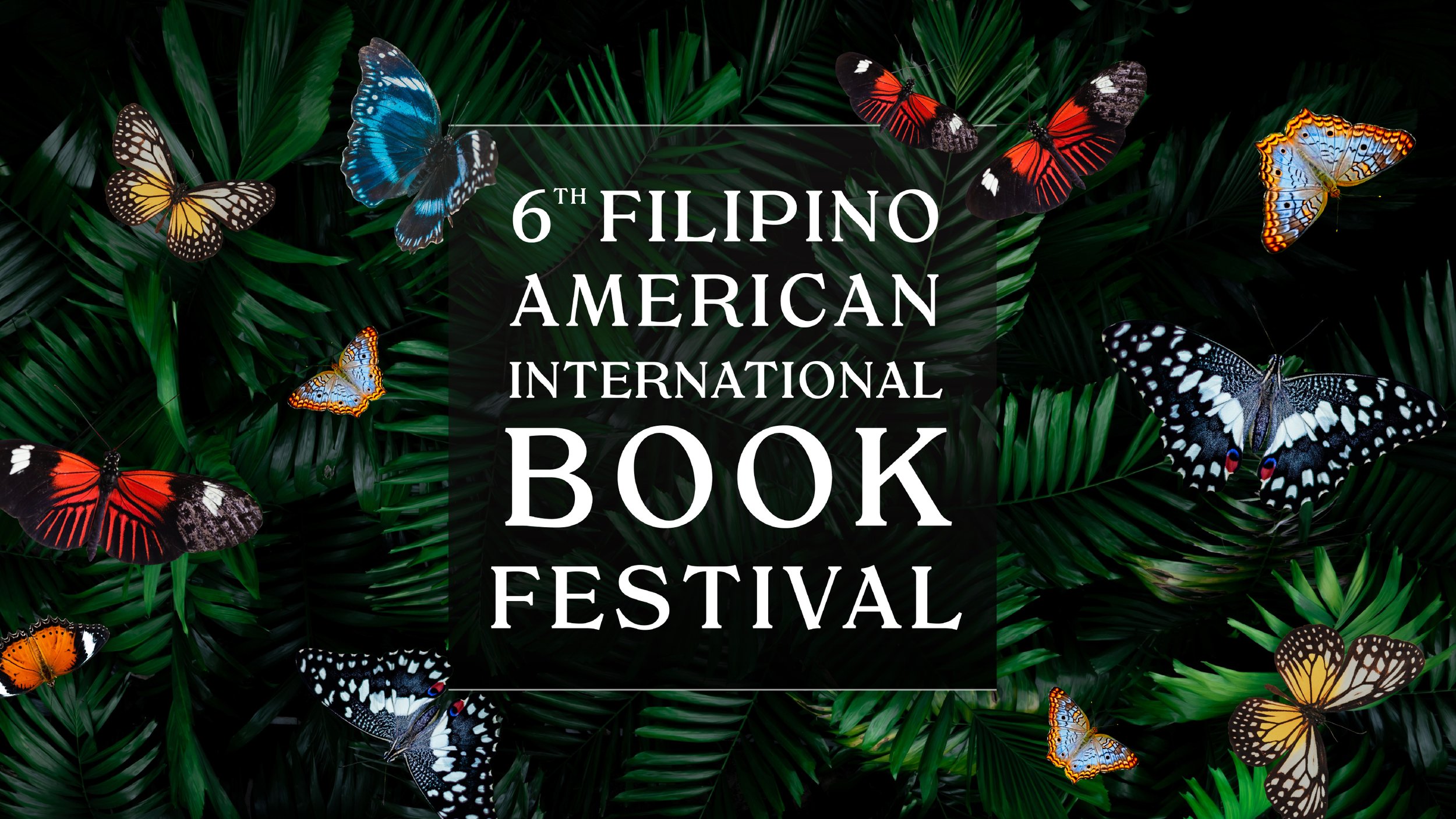
“Hiraya” is a Tagalog word for imagination, the embodiment of one’s hopes and dreams. It implies emergence—first the flower, then the fruit. First the dream, then the realization. Having postponed the festival for a year due to COVID-19, this celebration of Filipino and Filipinx-American literature was a much needed gathering after three years of isolation. “Hiraya” was a fitting theme for the 2022 festival.
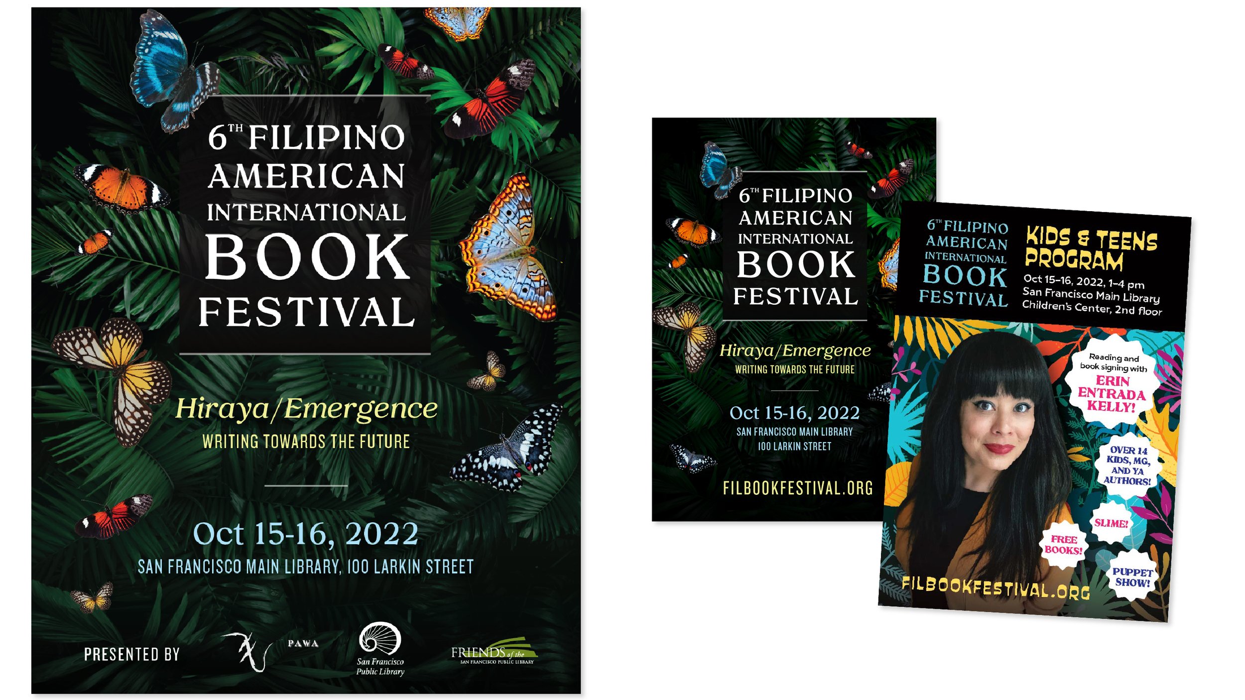
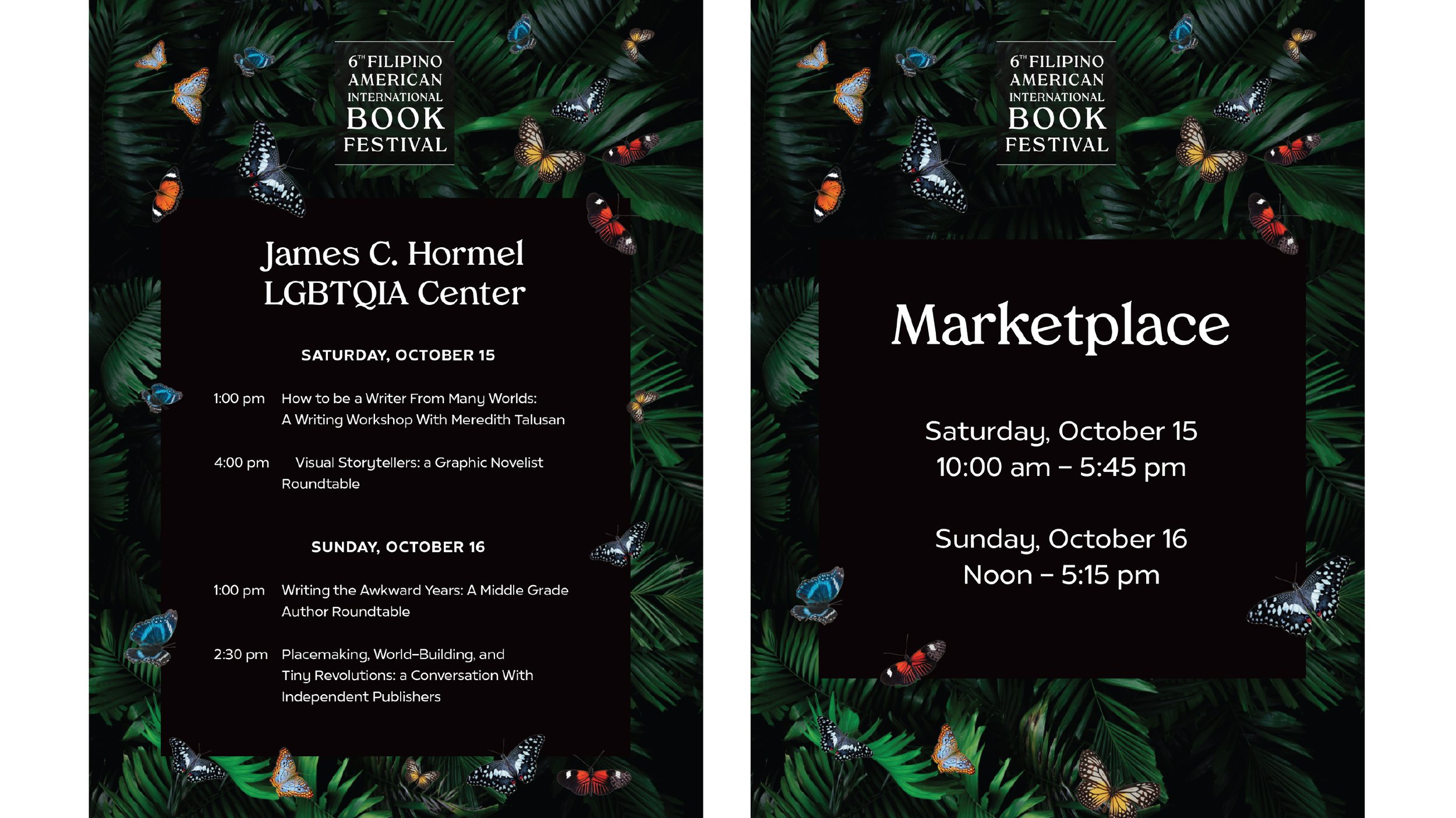
A collage of colorful butterflies against the dark dreaminess of the natural world visualized this quality of emergence across brand assets. Tropiline was the primary font used—a serif with organic, curved letterforms.
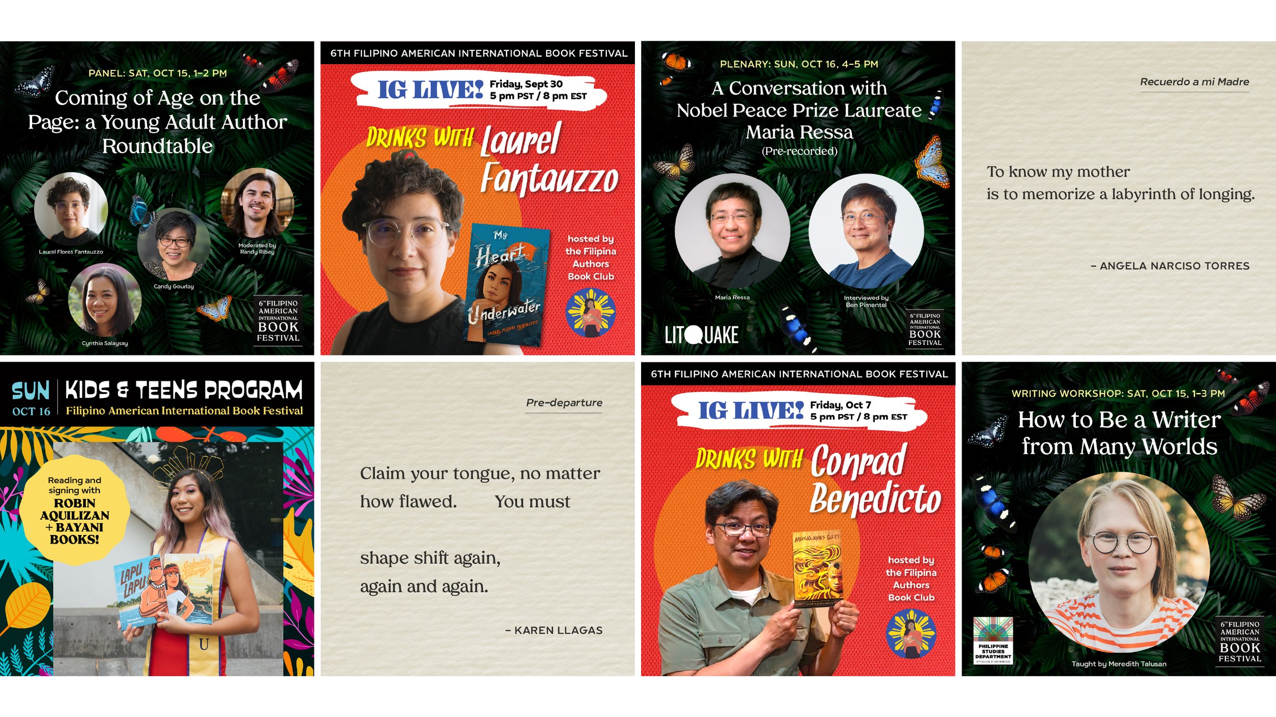
Social media assets used a variety of styles to catch audience attention—the primary butterfly visuals for panel announcements, a typographic set of poetic phrases from featured writers, and a bold red palette (complimentary contrast to the dark green of the primary brand) for time-sensitive IG Lives with featured festival authors.
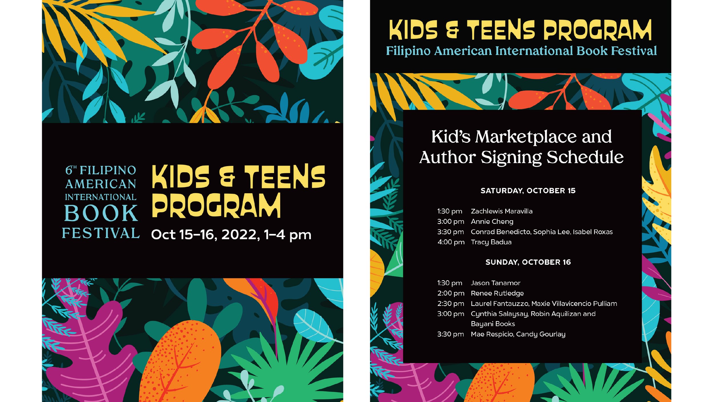
To set apart the Kids & Teens Program and speak to a younger audience, a playful plant illustration, the expressive font Custard, and a brighter color palette were used. The common use of Tropiline and plant themes tied the Kids & Teens Program to the overarching festival brand.
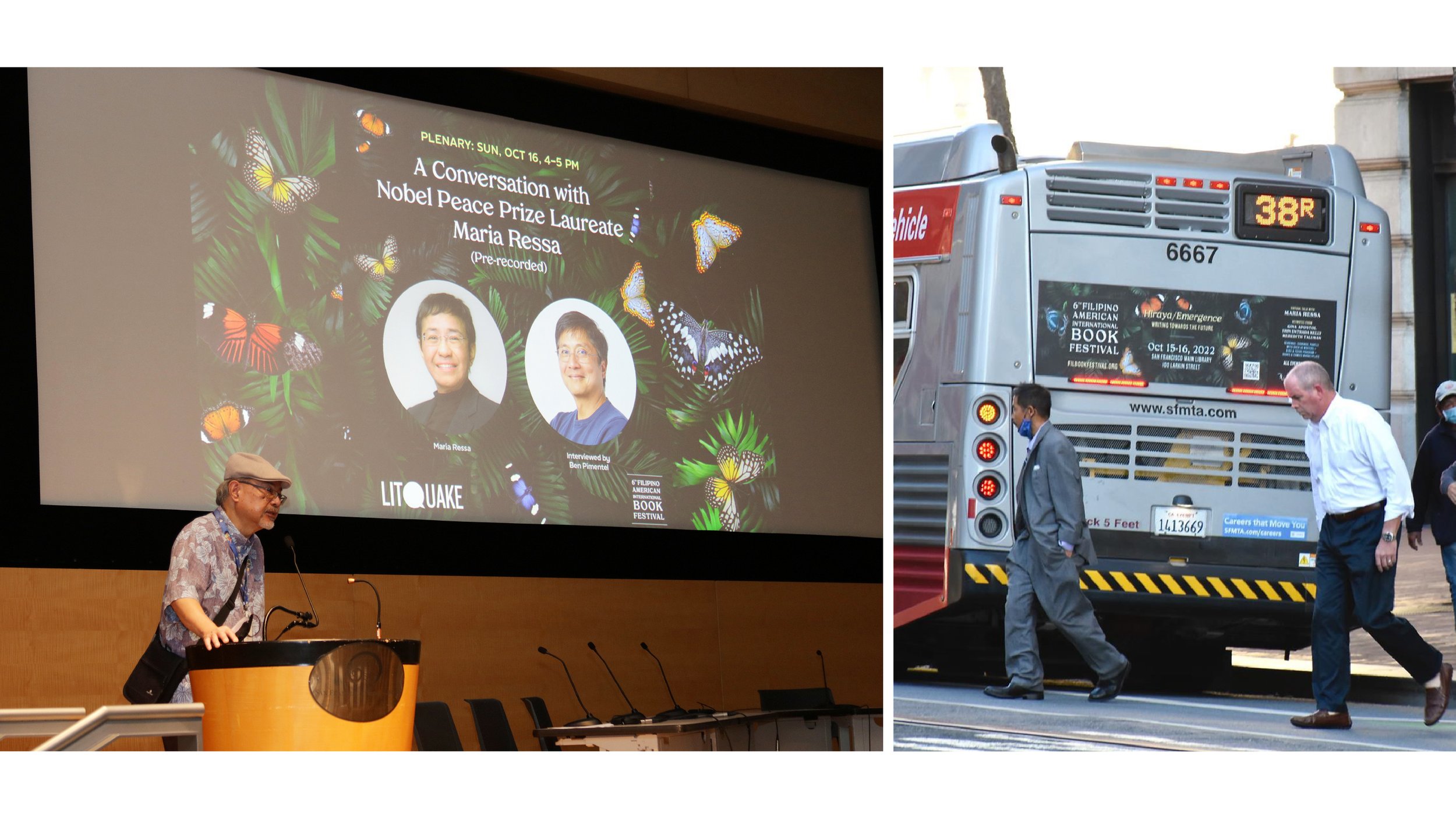
The marketing team at the San Francisco Public Library partnered with the festival to amplify the message through newsletters, print ads, posters, film reels, and MUNI bus ads. The design and messaging brought 500+ attendees to what was previously a modestly attended festival. Results included:
Organically growing the Instagram following from zero to 1,000+ followers over 6 months
Overflow attendance at the ethnic studies and comics panels
Marketplace vendors selling out of product on day one
On feedback forms, multiple attendees specifically praised the eye-catching festival branding, especially the social media campaign.